
A small business KPI dashboard turns the handful of numbers that actually predict trouble — or growth — into something you can check in two minutes a month. Most owners find out they have a cash problem the week they can’t make payroll, not three months earlier when the numbers already showed it coming.
Below is a free, fully-built small business KPI dashboard in Excel that you can download and start using today, plus a walkthrough of exactly how it’s built and why each metric is on it — useful whether you’re a business owner who just wants the answers, or an aspiring analyst who wants to see the formulas.
Want new templates emailed to you?
No spam. Unsubscribe anytime. Downloads never require this.
What’s Inside the Free Template
The workbook has four tabs, and you only ever type into one of them:
- Read Me — a one-page legend explaining the color coding and how the tabs connect.
- Monthly Inputs — the only tab you edit. Twelve months of revenue, costs, cash balance and new customers.
- Calculations — every KPI formula, fully wired to your inputs. You never touch this tab; it just works.
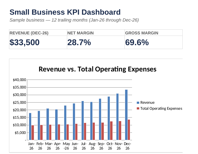
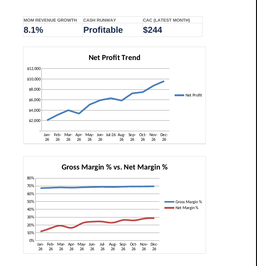
- Dashboard — the finished view: six scorecards and four charts, built entirely from formulas so they update the moment you change a number.
The 6 KPIs Every Small Business Should Track
There are dozens of numbers you could track on a small business KPI dashboard. These six are the ones that actually change a decision — each one answers a specific question an owner needs to ask every month.
1. Gross Margin %
Formula: (Revenue − Cost of Goods Sold) ÷ Revenue. This tells you how much of every dollar you collect survives after paying for what it directly cost to deliver the product or service — before rent, payroll or marketing even enter the picture. A gross margin that’s slowly shrinking usually means your costs are creeping up faster than your prices, long before it shows up anywhere else.
2. Net Margin %
Formula: Net Profit ÷ Revenue, where Net Profit = Gross Profit − Total Operating Expenses. This is the real answer to “am I actually making money?” — after payroll, rent, marketing and everything else. Revenue can grow every month while net margin quietly falls; net margin is what tells you the truth.
3. Month-over-Month Revenue Growth
Formula: (This month’s revenue − Last month’s revenue) ÷ Last month’s revenue. A single month of growth means little; three or four in a row means something is working (or not). This is the number to watch alongside margin — fast revenue growth with falling margin is a common warning sign that you’re buying growth at an unsustainable cost.
4. Cash Runway (Months)
Formula: Current Cash Balance ÷ Trailing 3-Month Average Burn. “Burn” is simply how much cash you’re losing each month when expenses exceed income. If you’re consistently profitable, this shows as “Profitable” instead of a countdown — but the moment burn creeps back in, this is the single number that tells you how many months you have to fix it.
5. Customer Acquisition Cost (CAC)
Formula: Marketing Spend ÷ New Customers Acquired. This is what it actually costs you, on average, to bring in one new customer that month. Tracked over time, a rising Customer Acquisition Cost (CAC) is often the earliest sign that a marketing channel is wearing out — well before the marketing budget conversation happens.
6. Operating Expense Ratio
Formula: Total Operating Expenses ÷ Revenue. This shows what share of every revenue dollar is going to overhead — payroll, rent, software, marketing — rather than direct costs. It’s the fastest way to see whether your overhead is scaling sensibly with the business or slowly outgrowing it.
How the Workbook Is Built
If you read our guide to financial modeling, the structure of this small business KPI dashboard will look familiar — it follows the same core discipline: inputs, calculations and outputs are kept on separate tabs, and every number on the Dashboard traces back to a formula, never a typed-in result. That’s what makes it trustworthy — change January’s revenue and every scorecard, every chart and every margin recalculates instantly, because nothing is hardcoded.
The color coding follows a standard analyst convention so you can always tell what you’re looking at: blue text is a number you typed in, black text is a formula, and green text is a formula pulling a value in from another tab. Once you know that convention, you can open any financial model — this one or someone else’s — and immediately know which cells are safe to edit.
How to Use It Every Month
- Once a month, open the Monthly Inputs tab and add that month’s actual revenue, costs and ending cash balance.
- Check the Dashboard tab — it’s already updated. No copying, no re-building charts.
- Watch the trend, not the single month. One weak month is noise; three in a row is a pattern worth acting on.
- If Cash Runway ever stops reading “Profitable,” that’s your cue to look at spending before it becomes urgent.
Download the Small Business KPI Dashboard
It’s free, there’s no email signup, and it’s pre-loaded with a sample year of data so you can see exactly how it works before you replace it with your own numbers.
For the full picture behind these KPIs, pair this dashboard with our Profit and Loss Statement Template, which breaks down exactly how revenue turns into profit each month. If any of your unit-level metrics look thin, our Break-Even Calculator shows exactly how much volume you need to cover costs. And if these KPIs have you thinking about a sale or bringing on a partner, our Small Business Valuation Calculator turns your numbers into an estimated business value.
